Budgeting & Money Saving Application
Money$averz – Save, Plan, Live.
Master of User Experience Design: Capstone Project
07/06/23-08/24/23
Role
UX Researcher, UX Designer, UX Writer
UX Skills
User Storyboards, Proto-personas, Personas, Interview Guides, User Interviews, Wireframes, Journey Mapping, Prototyping, Usability Testing, Affinity Mapping, Feature Mapping
Software Used
Figma, Mural, Miro, Asana, Keynote, Pages
Research Methods
Qualitative & Quantitative Analysis
A brief demo of the prototype created can be found near the end of this case study. Click here to jump to it.
Project Overview
The goal of the product was to help young adults maximize their money by saving money on everyday purchases, and to help them consistently budget.
This was a solo project in which I worked as the user experience researcher, writer, and designer.
It was my capstone for my master’s degree, in which I had eight weeks to research, design, test, validate, and revise this project.

Problem Statement
My desk research would form the problem statement I was looking to solve:
Money conscious people who feel that saving money is too hard need to budget and save money, but they often miss opportunities to do so every single day.
Understand
Desk Research
I found that 38% of people aged 18-26 have credit card debt that exceeds savings and 89% of all people were worried that their emergency savings were insufficient. Based on this initial desk research, it seems that
young people often struggled with finances, especially those aged 18-26.
Proto-personas
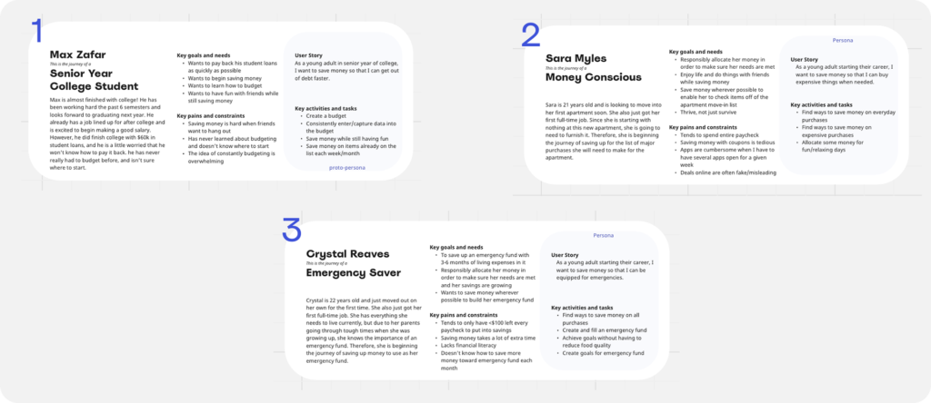
I created 3 proto-personas to begin researching and validating:
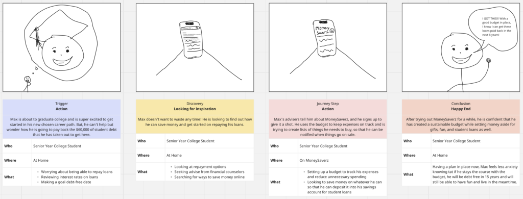
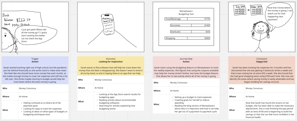
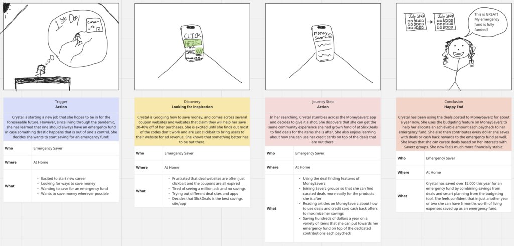
I then created 3 corresponding storyboards to pair with them:
Competitive Analysis
I selected three of my five direct competitors to focus in on. They were SlickDeals, Mint by Intuit, and Rocket Money. SlickDeals offer deals on almost anything as it is primarily ran by the community that uses it. Rocket Money and Mint both offer a decent, functional feature set but lack much ability to customize the experience.
My users stated the following about these competitors:
– 3/6 said that SlickDeals was specifically overwhelming and pressured them to spend money.
– 5/6 said that the budgeting apps they had tried (including Rocket Money and Mint) just didn’t offer enough customization to fit their needs, so they ended up reverting to Excel.
The complete analysis is a bit lengthy, so please view it here if interested.
Research
Tools
Methodology
I chose to conduct qualitative interviews for my user research. I wanted to create an app that would improve people’s everyday lives, so I really needed to understand their struggles and frustrations. I wanted to hear their stories and experiences.
Approach
I conducted 2 rounds of interviews, with 6 participants the first round and 3 of those I revisited for my second round. They all consisted of one-on-one interviews lasting from 20-40 minutes.
Analyze
Persona Validation
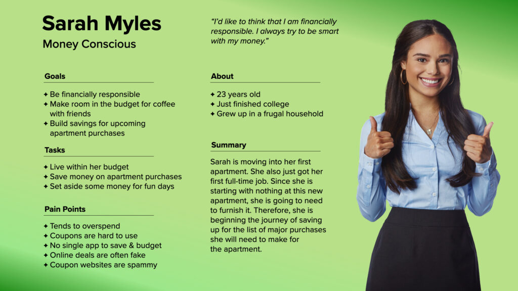
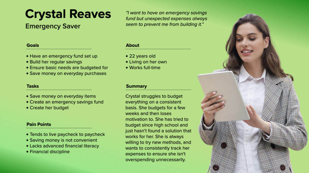
Two of the three personas were validated with some modifications needed, and the third was discarded. The two validated personas were Sarah and Crystal:
Key Insights
In order to better understand the common needs of my users, I created an affinity map of the results from my user research.
– 5 out of 6 users used Excel as their budgeting software, even though it was 100% manual. They preferred that over the apps, which failed to provide the customizability they desired.
– Everyone wanted an easy budgeting application that allowed them to customize the experience based on what was important to them.
– 3 out of 6 said that SlickDeals was specifically overwhelming and pressured them to spend money.
– All of my interviewees grew up in frugal households where money was not really talked about.
– Users tend to think that saving 20 or 30¢ here and there isn’t worth the effort it takes to do so.
– All of my users wanted to save money, but they said it has to be easier to save money than to not.
Wireframe
Due to the rigorous timeline of 8 weeks, I had to skip mid-fidelity testing. I felt okay doing this though, as I based a lot of my final design work off of Apple’s iOS 17 design system. This helped a lot in ensuring things were accessible and cohesive, but given more time I would have included a round of usability testing for mid-fidelity.
Low-fidelity
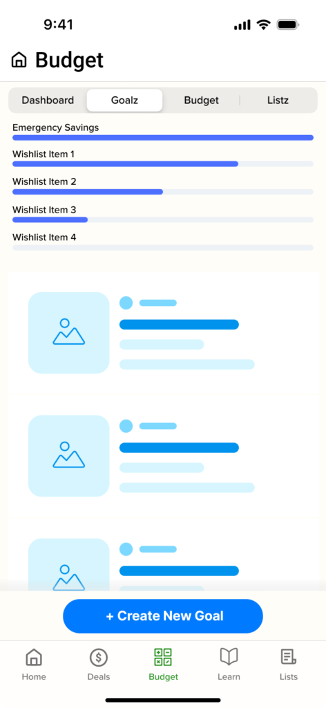
I had several design ideas and I had to work through all of them along the way. See the “Hurdles” section at the end to see what big things I learned from early wire framing.
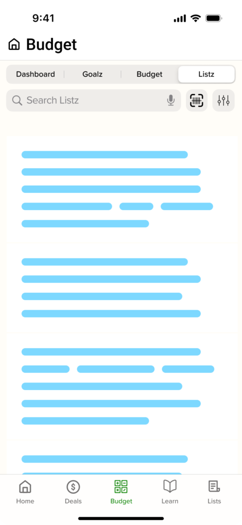
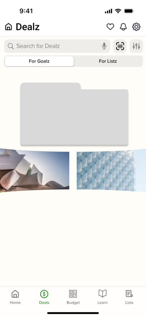
Mid-fidelity
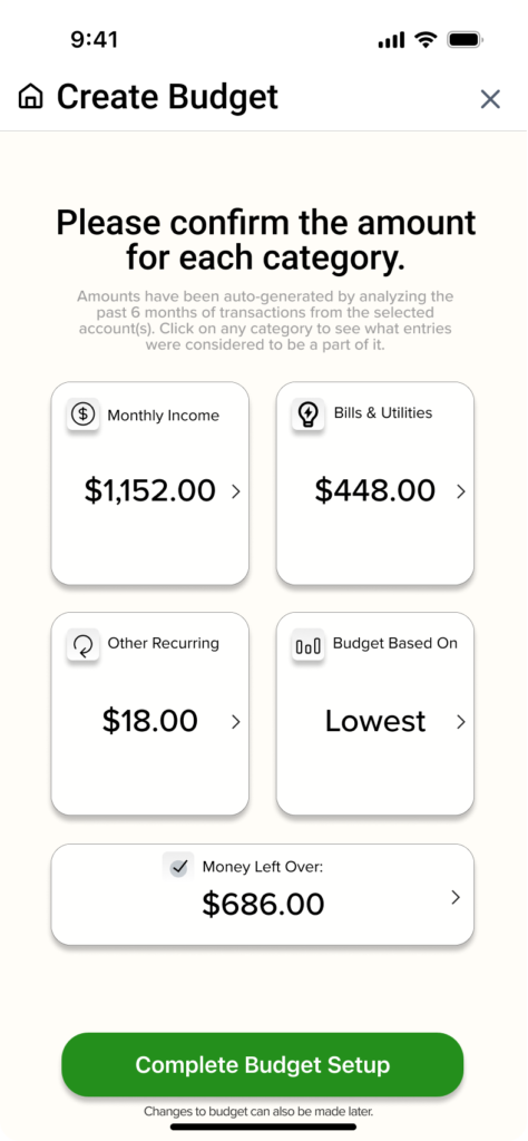
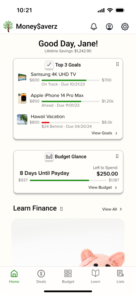
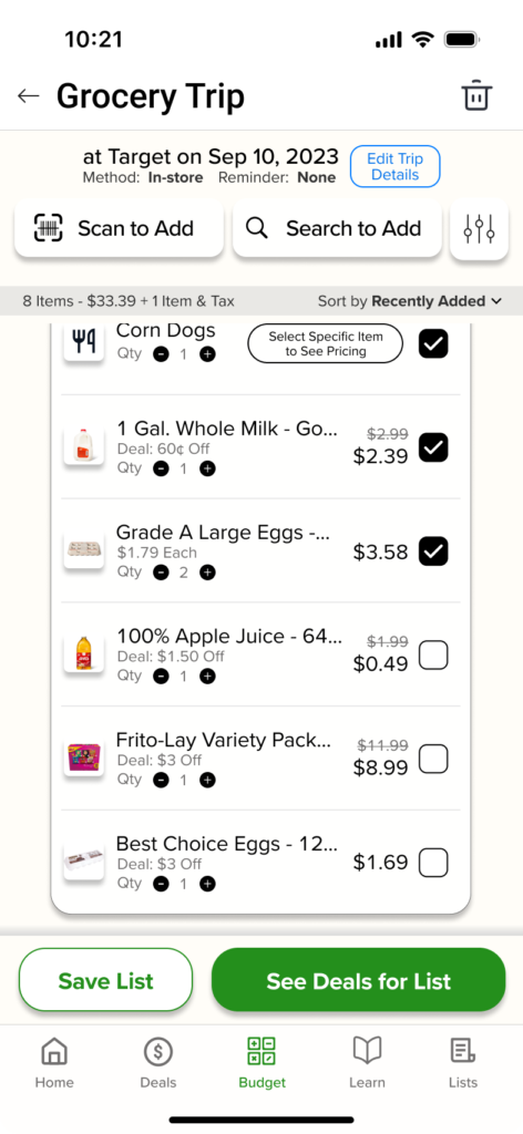
I quickly moved into mid-fidelity as I needed more context for features such as lists and the goals. I was running a bit behind by the end of mid-fi wireframing, forcing me to skip usability here and wait until the prototype was done to test usability. It was very risky, but ended up turning out great.
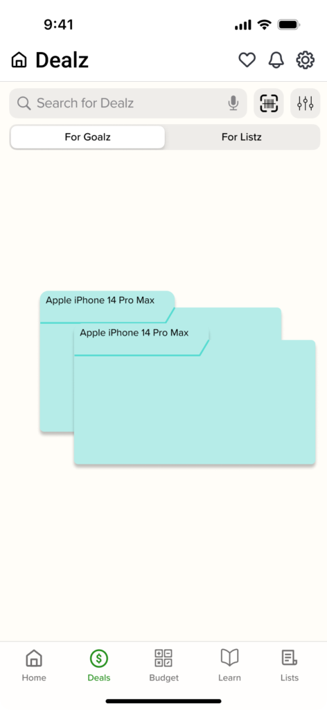
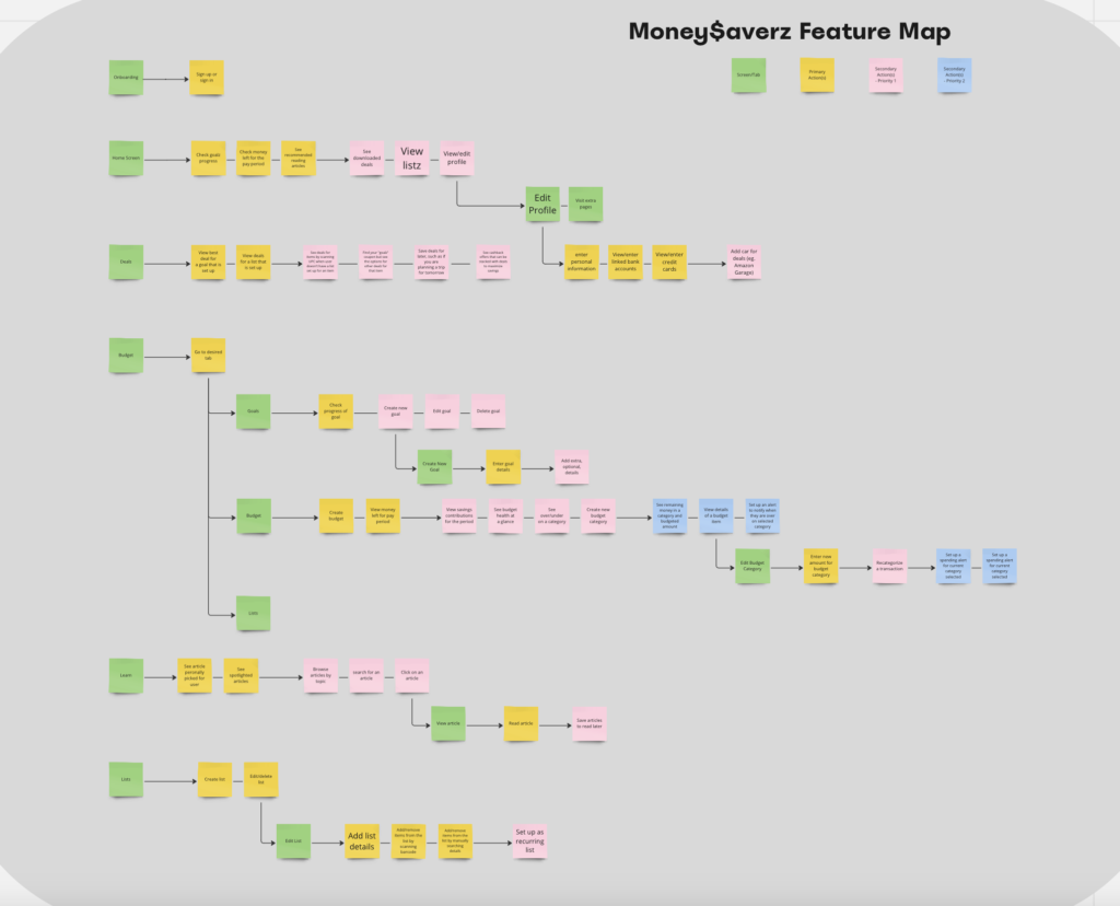
I needed help focusing in on tasks each day so that I could have trackable progress goals. This feature map allowed me to ensure that I was always working on something related to the core functionality.
Prototype
(See end of case study for prototype link.)

Journey Maps
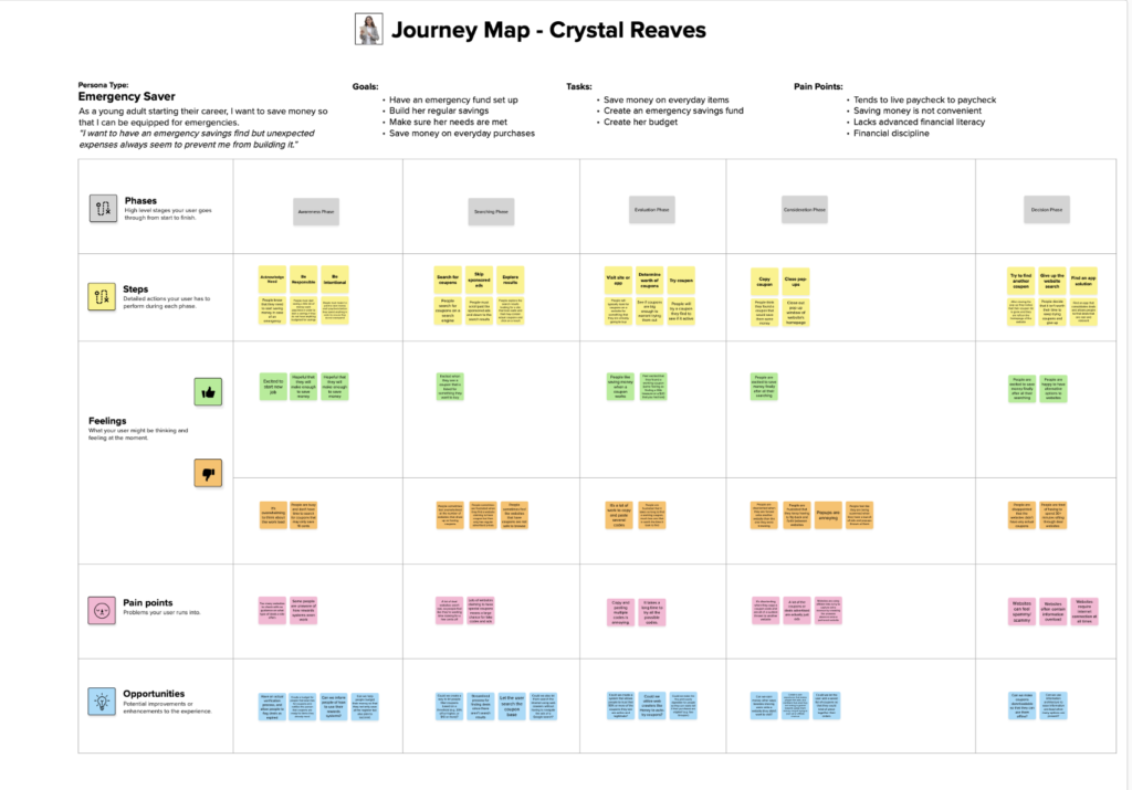
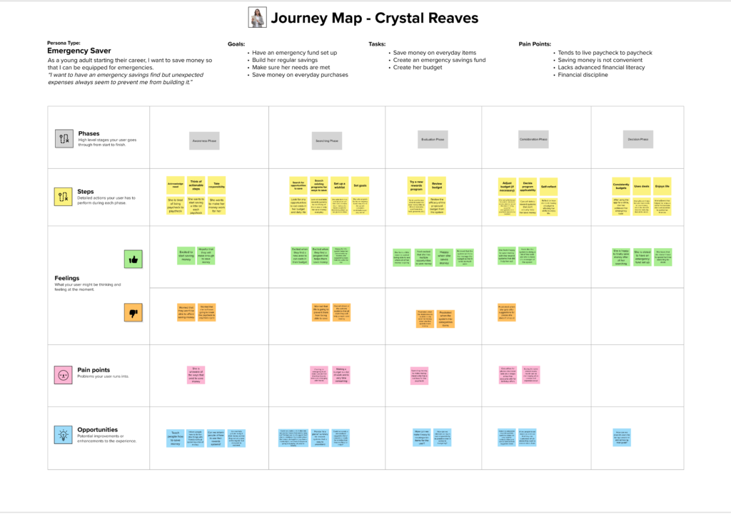
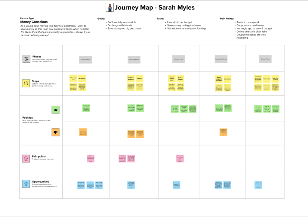
I then created a current and future state journey map for the Emergency Saver and a future state journey map for the Money Conscious persona. Click on a journey to view it on Mural.com in a new tab:
Test
Usability Testing
I was fortunate enough to schedule a usability test with all 6 of my original interviewees from user research. I conducted 6 one-hour usability tests, as there were a lot of features to test. I performed qualitative and quantitative research within each interview.
Key Insights
In order to better understand the common needs of my users, I created an affinity map of the results from my user research.
– People LIKE easy. They all 6 mentioned how easy my app was to use and how important that was to them personally.
– Several comments on everything being well labeled and easy to understand.
– Not a single user felt overwhelmed by the deals.
– Not a single user felt pressured to buy anything that they weren’t originally planning to.
– All of my participants fell in LOVE with the lists feature set! So much so, that it actually got broken out into its own tab on the nav bar instead of being within another tab.
– Overall, the feedback was overwhelmingly positive, and all the users had 1 or more great suggestions for new features and for minor enhancements
My favorite comment from usability testing came from my third interview:
“It’s everything I would want in an app!
I’m mad that I can’t download this app today!”
Revise
Hurdles
Now during this process, I had made several mistakes, and had to make several revisions. These suggestions came both from my instructors during the first 5 weeks, and from my users for the last 2 weeks or so. I would end up spending 24 hours in a week just revising and editing.
Working with my instructors, I was able to solve a lot of problems that came from my own bias. With the users, I was able to fix a lot of the oversights that I had made, and was able to enhance the features.
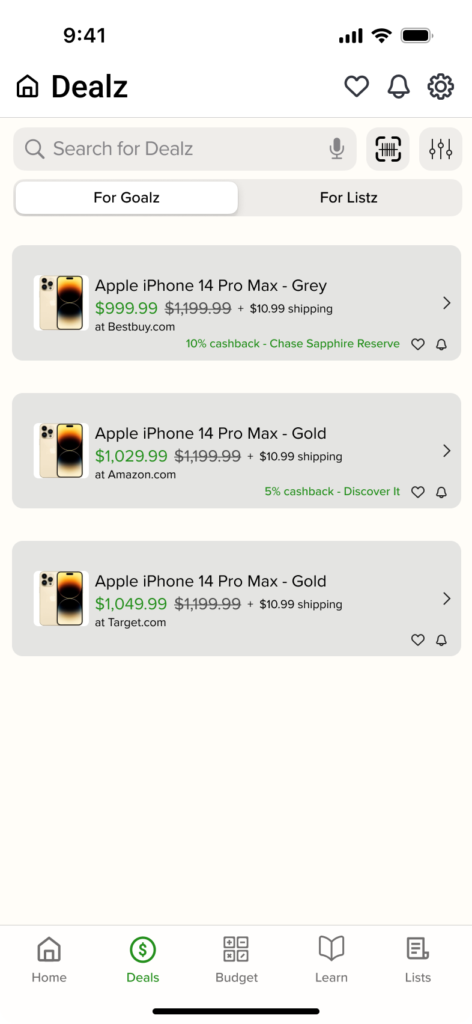
An initial show-stopper was that I had planned to use the letter Z instead of S for branding purposes but that ended up making users feel like the app was a scam. This was of course a major problem, so I immediately returned all words to normal spelling and it fixed it right up.
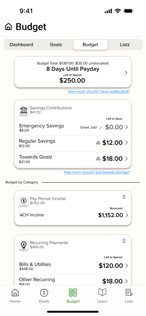
The biggest struggle was how to show the budget to the user in a way that is easy, efficient, and summarized, without sacrificing context to understand what the numbers mean.


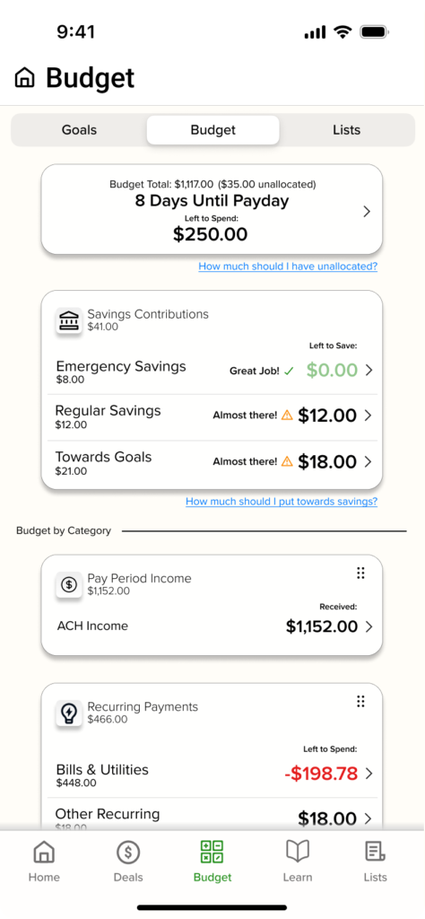
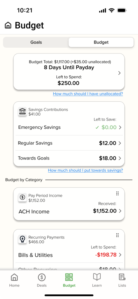
Other Revisions
– Added a couple of loading screens where appropriate to avoid jarring user experience.
– Added in the ability to locate the other 1/2 of one’s budget during initial setup. This was something I somehow overlooked that my users helped me find.
– Ability to add quantity when adding items to a list.
– Ability to “find” quantities less than the quantity original set for a list item.
– Users complained that there were too many screens to go through when redeeming a deal. There were originally 3, now there are 2 and they like that much better.
– Increased visibility of price matching feature as it was previously buried. A couple users helped point this one out to me as well as they were really interested in the price matching feature.
Prototype Demo
This app was designed to be WCAG AA compliant with contrast ratios.
Next Steps
Pre-release Must-have’s
Features that need to be built out before any thought could be made of moving to development:
– Learn page. This feature ended up being moved out of scope to focus on the saving and budgeting.
– Downloads. They will have the ability to download deals for offline use.
– Settings. I have started them but they need to be polished and rounded out as far as the options go.
– Profile. This is where they could add their car to get deals that would work with their car, and tell the app a bit about themselves such as what rewards programs and credit cards they have.
– All of my participants fell in LOVE with the lists feature set! So much so, that it actually got broken out into its own tab on the nav bar instead of being within another tab.
– Found area. This is on the lists and would move found items off the normal list into a greyed out sub list below the “active list.” This way they could account for the store not having items they wanted.
– Notifications. There could be some cool things done with notifications such as pulling up a list when you are walking into a store that you said you were going shopping at. This would need to be built out.
Pre-release Nice-to-have’s
Features that would be nice to have built out before moving to development:
– In-app browser. This would make price matching smoother than pulling up the item via Safari. (This is mentioned in the prototype video as it is the intended end-goal for the feature.)
– Scan to find. The users had some great ideas on how to improve this feature, but it was out of scope.
– Categorization rules. This would help reduce mis-categorizations by the app. (e.g. You could say <$10 at a gas station is probably snacks and thus food, whereas maybe >$10 is probably gas.)
Special Feature
Not required to have before releasing, but it would definitely add to the user experience:
– Cash back reward. Before release, I would love to have it where the app rewards users with a $10 cash back or something. They would receive this for meeting certain saving milestones. However, I would have to partner with a company that could offer this, as I would not have that ability.
Version 2.0
My users had some other great ideas for some features, but they specifically requested they be pushed to v2.0 so that the app could come out sooner because they wanted to use it today. These included:
– Subscription management. This would allow you to see upcoming recurring charges.
– Visual historical analysis. Some users wanted to be able to see like month-over-month reports or a year-end annual report and to see an interactive chart of their spending summary for various periods.
– Geo-tracking. They thought it would be cool to see taxes included in the totals but realized that to do that the app would need to implement geo-location services.
Project Reflections
I learned a ton about designing for your specific users, and about the design process as a holistic journey by creating Money$averz. My main takeaways are below:
– Everyone wants to save money! It helps us feel accomplished when we score a great deal.
– Young people expect very fast and efficient programs. If an app takes too long to load something, they will instantly lose trust in it’s ability to help them.
– I was shocked at how many other young people felt like they did not learn enough about finances and had to teach themselves
– I found if you stick with something through the hurdles, eventually you’ll reach that elusive finish line!
– I think my biggest takeaway from this project though, is that people want technology to work for them… INSTEAD of working to use technology.
Check Out My Other Projects
